Previous
Next
Top
Project Overview

Portfolio
The Hmong Cloth

The Hmong Cloth

The Hmong Cloth holds a collection of stories based on a Hmong story cloth. The story cloth illustrates certain events that occurred as a result of the Hmong’s involvement in the Vietnam War. The stories tell of the people’s experience of these events.

Project Overview

The Hmong Cloth

The Hmong Cloth holds a collection of stories based on a Hmong story cloth. The story cloth illustrates certain events that occurred as a result of the Hmong’s involvement in the Vietnam War. The stories tell of the people’s experience of these events.


Project Overview

This is a personal conceptual project.

The Problem

There are many books, documentaries, and exhibits that documents the Vietnam War and how the Hmong people were affected by it. It can be tedious to dig through these documents if you were interested in hearing just the stories of different people and their journey.

The Solution

A desktop-first website that holds a collection of stories about the journey and experiences of the Hmong people after the Vietnam War. These stories are guided by a Hmong story cloth so that it's easier to categorize and find stories specific to the journey depicted in the cloth.

My Responsibilities

Art direction, visual design, information architecture, user experience design, web development
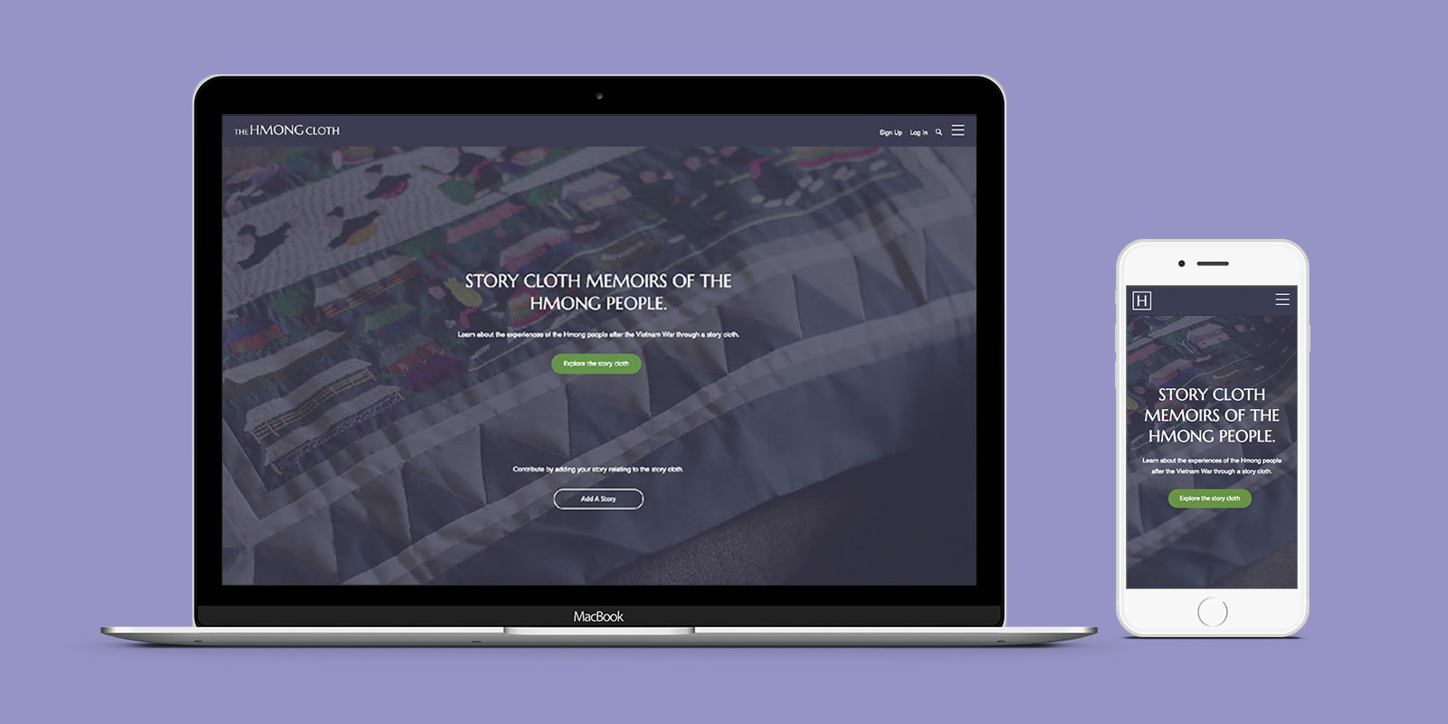
Homepage
Story Cloth
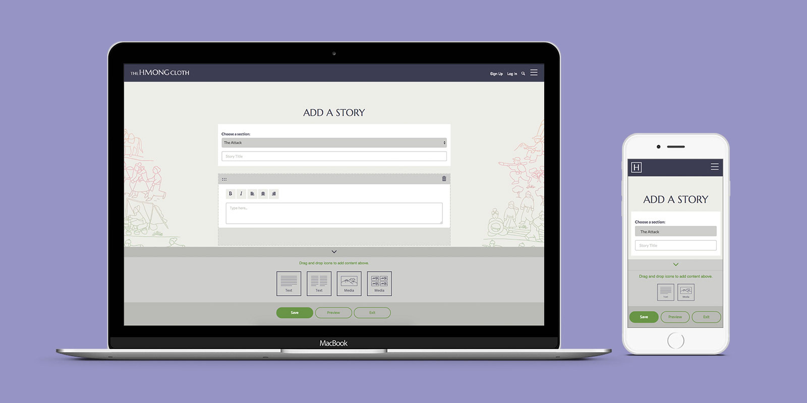
Add A Story
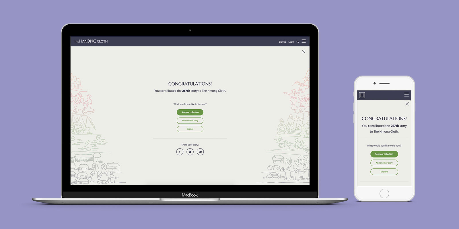
Publish Story
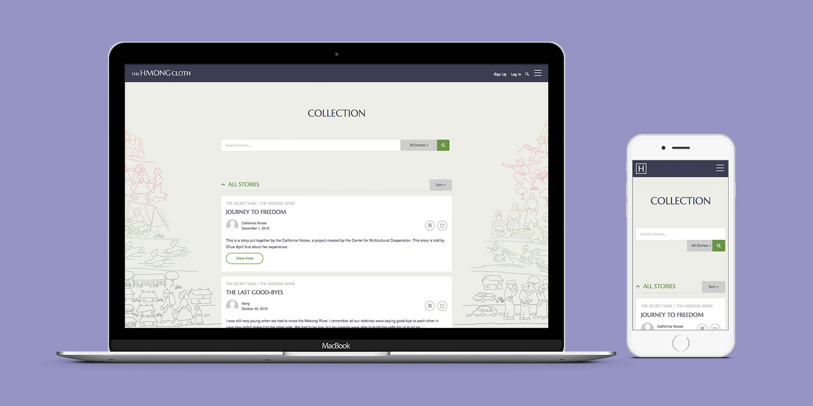
Collection
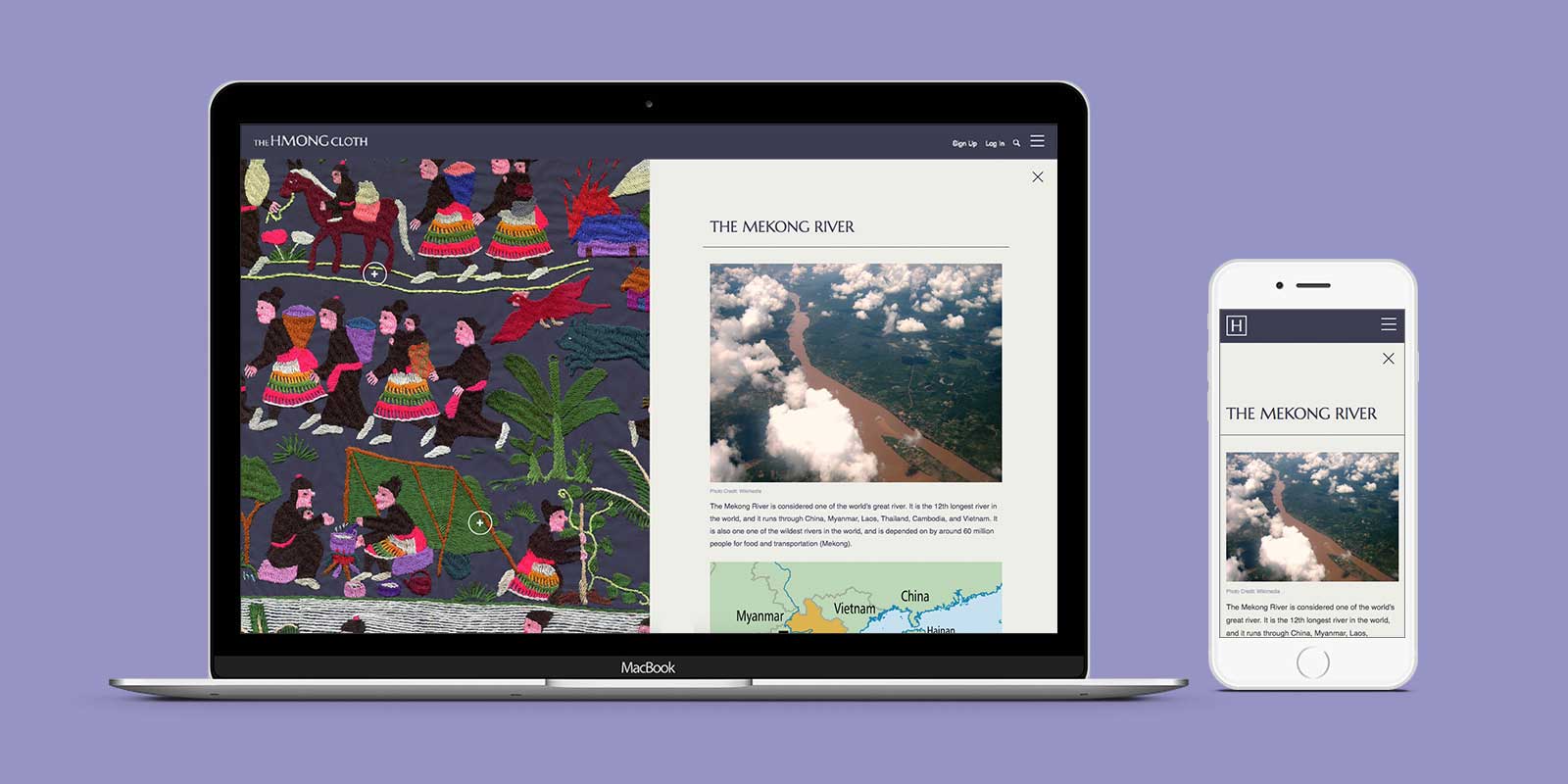
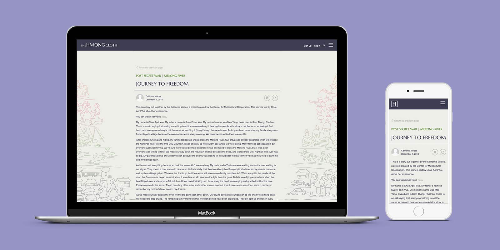
Story

Pretty cool, right?

Learn more about me by seeing how I work.

See More

Project Details

Research: Why We Share

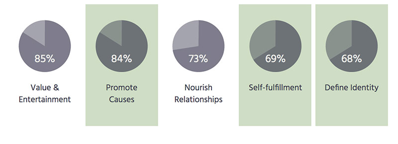
A study of 2,500 participants by New York Times concluded that people share content for different reasons. Value & entertainment, promoting causes, nourishing relationships, self-fulfillment, and defining identity were among the top reasons.

The reasons highlighted in green gives us an idea of what can inspire or motivate people to share stories on The Hmong Cloth.

Survey

Research: Preference/Behavior Towards Online Sharing

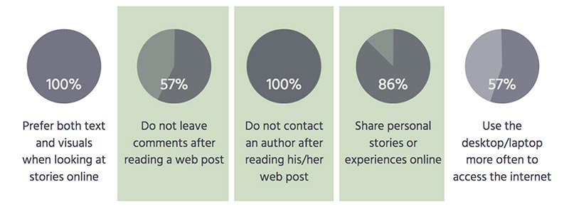
People have different preferences and behaviors towards sharing online. Though the sample size for this survey was small, it gives me a general idea that people do share personal stories online, and they do comment and respond to other posts, but they are less likely to directly contact an author of a post.

The feedbacks highlighted in green helped me prioritize the features in the project.

Survey

Brainstorming

Spending time interviewing potential target audiences and brainstorming the personas, user stories, and information architecture were very helpful in developing the rest of the project.

Questionnaire

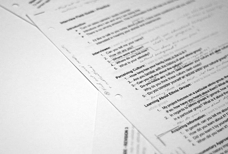
Explorative questionnaire

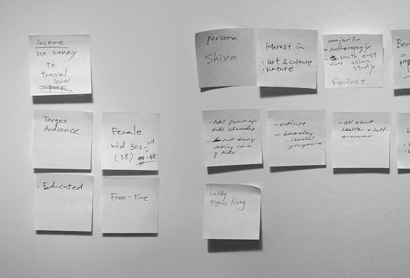
Brainstorm - Target Audience

Brainstorming a persona

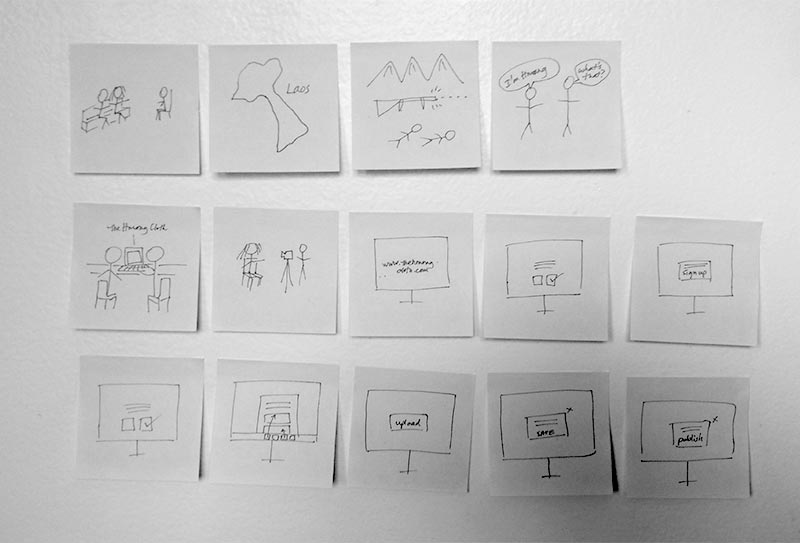
Brainstorm - User Story

Brainstorming a user story

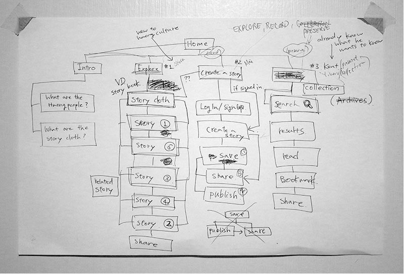
Brainstorm - Information Architecture

Brainstorming the information architecture

Target Audience

American females ages 28-45. They have a consistent daily routine and have intermediate technology skills. They are educated, enjoy reading, going to museums and exhibits, and learning about people of different cultures.

Moodboards

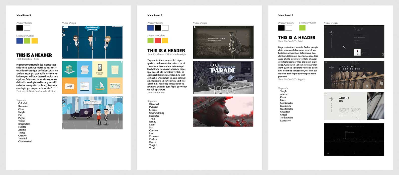
I defined 3 simple moodboards regarding color, type, and visuals: stylized, realistic/photographic, simplistic. After reviewing them, these were the conclusions:

  • The stylized mood board waters down the seriousness of the event.
  • The realistic/photographic mood board suits the project by giving the topic the attention it deserves.
  • The simplistic mood board doesn’t say enough about the event and does not emphasize its importance.
Moodboards

Name, Tagline, and Logo

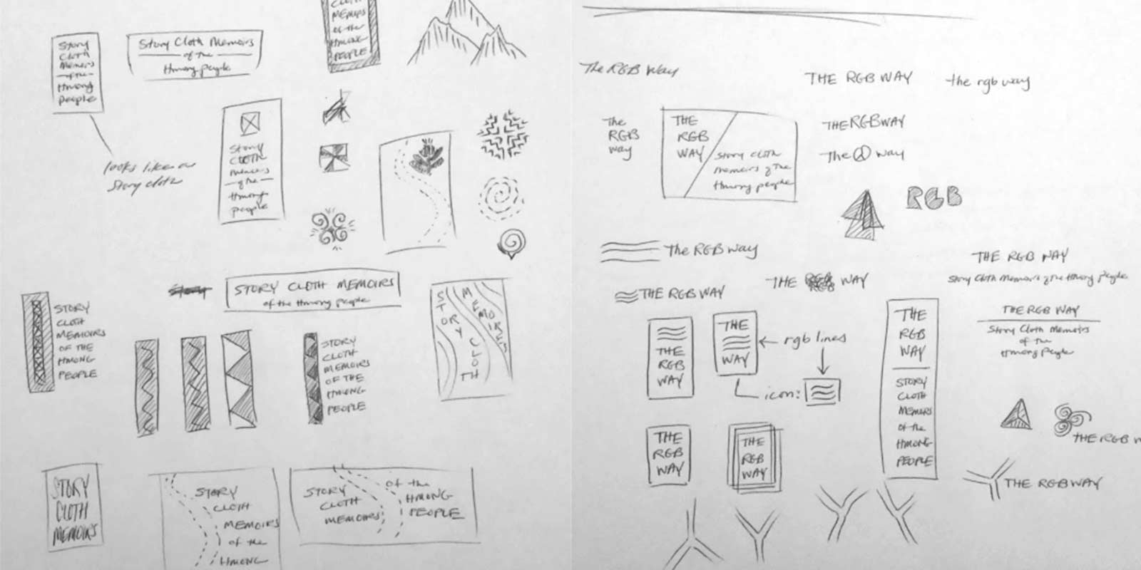
I brainstormed a variety of names, taglines, and logos to try to capture the purpose of the website. I wanted to focus on the people’s perspective of the event rather than focus on the historical details.

Brainstorm - Logo
Logo Variation
Logo Variation

Fonts

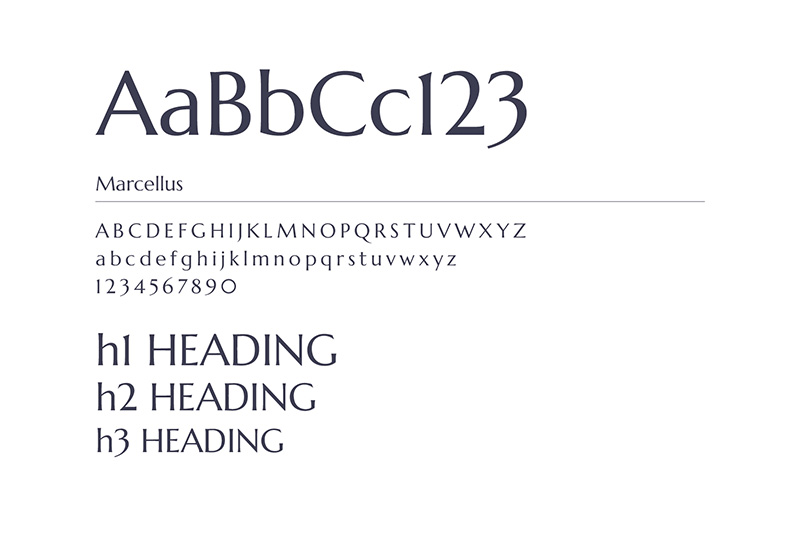
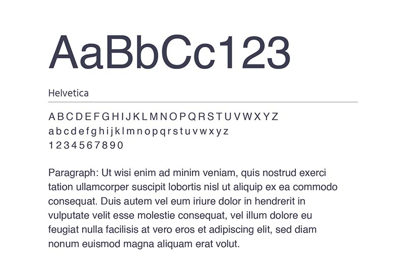
I used Marcellus and Helvetica fonts. Marcellus has humanistic features, where it looks clean, but the curves of each character gives it an organic feel. It has a personality that goes well with the topic and the story cloth. Helvetica is a very neutral font that complements Marcellus very well, plue it's scalable on screen.

Font
Font

Color and Interface

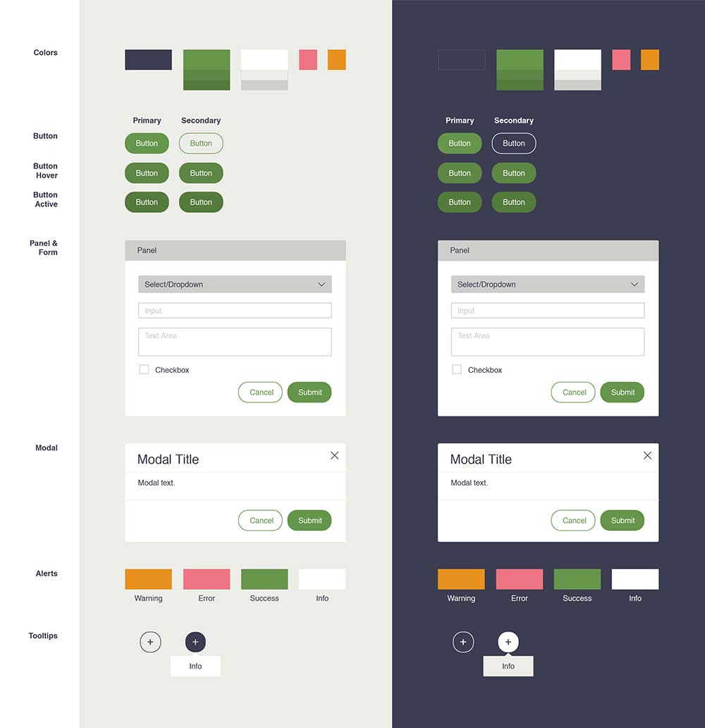
I considered a couple of color schemes. The initial interface was a dark desaturated blue. Visually, it looks great and works well, but because the website is text-heavy, the light text on the dark background was hard on the eyes. Revising it to dark text on a light-colored background made it easier to read.

Color and Interface Assets

Visual Style

I considered various visual styles for the cloth, for example: embroidered (original), imitated, and stylized.

The original idea was to hover over each section of the cloth and animate the figures to move around. This would have been achievable if I had chosen to stylize it. As I talked with the users about the project, I realize that many don’t know what a Hmong story cloth is. I decided to stay with the original style of the cloth so that users can see the embroidered details that make these story cloths so attractive and intriguing.

Visual Styles

Wireframes

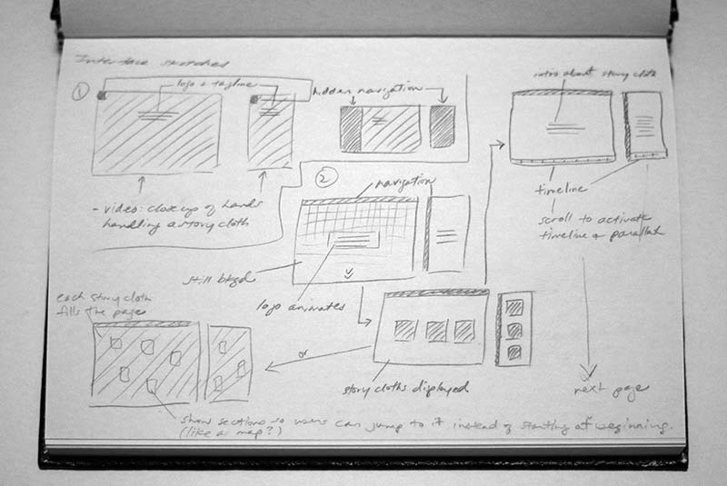
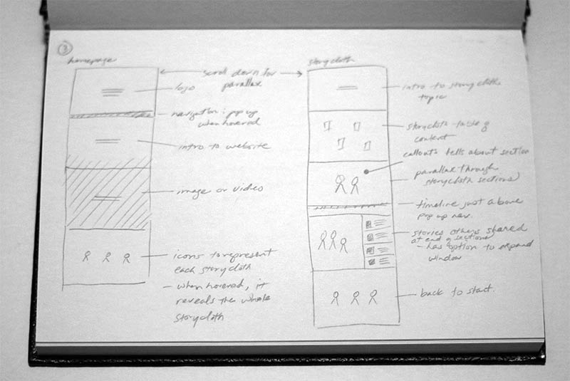
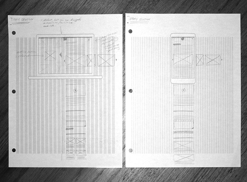
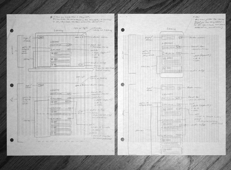
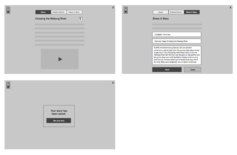
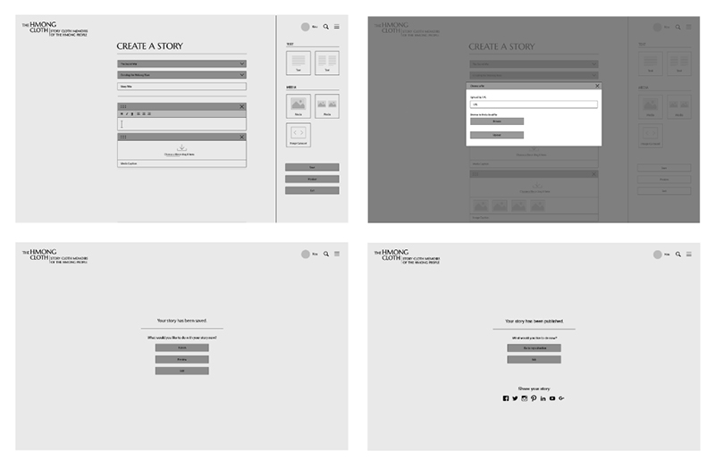
I explored different layouts and interactions. Even though the website is desktop-first, it is still intended to be responsive.

Brainstorm - Interface
Wireframes
Wireframes
Prototypes
Prototypes